Pouring into the coffee community.

A person wearing a blue and white striped shirt carrying a large tan tote bag with white text that reads "BUT FIRST, FAMILY" and smaller text underneath that says "COMMON COFFEE & CO."

It’s no secret that a good cup of coffee can spark joy. Far from a quick caffeine fix, coffee continues to bring us all together, whatever the occasion. So when we were asked to help a community-focussed van vendor to connect with their online customers, our taste buds tingled...

When it comes to a personal service, Slow was quickly convinced that Commer were the go-to guys. It was crystal-clear to us that their vision was to create special moments and memorable events, serving quality coffee by grounded people.

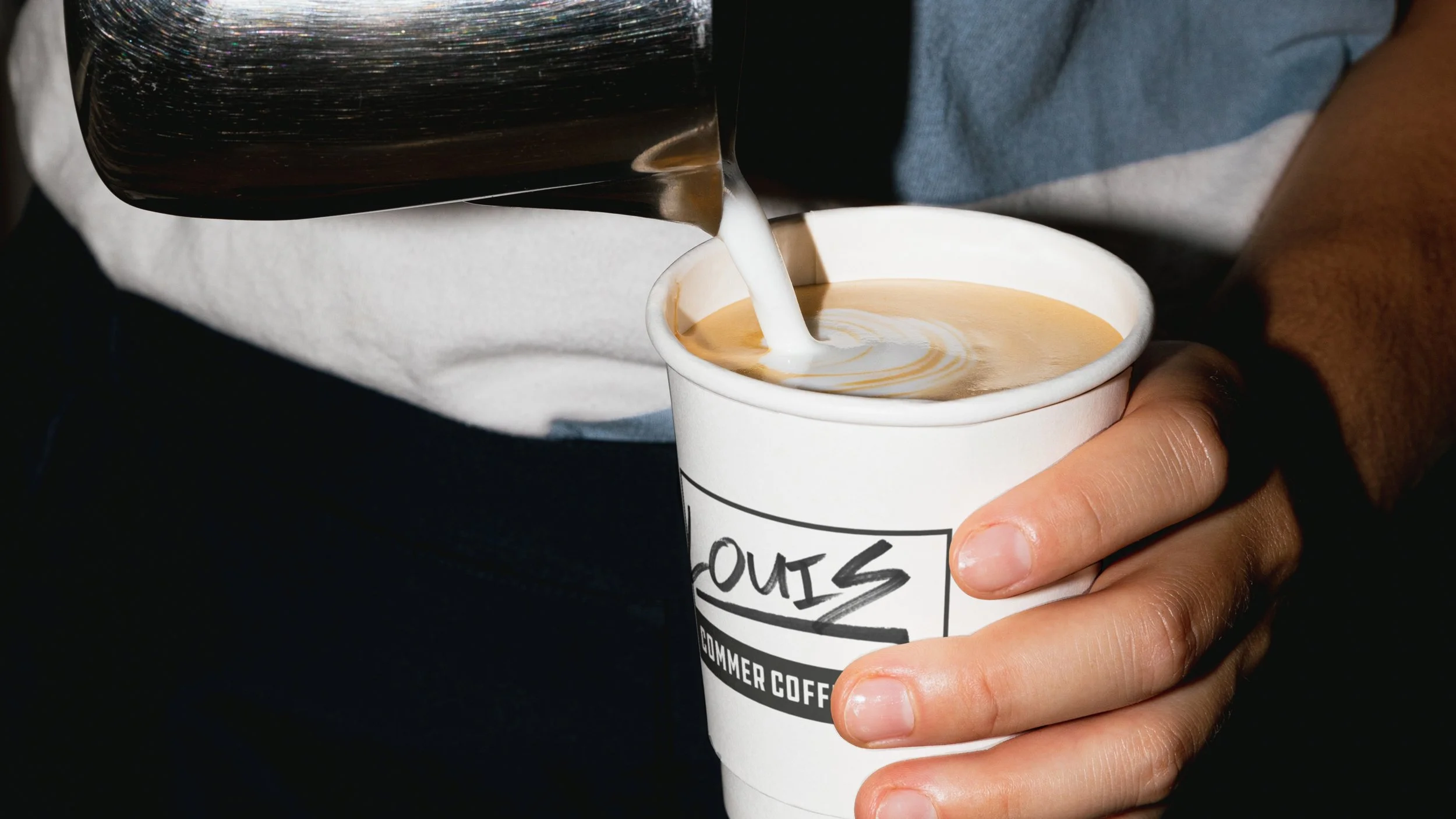
Inspired by their core value to create better not bigger , we developed a brand based around their van, ‘Daisy’. With a warm logo, bold packaging and a suite of iconography to savour, all that was left to do was to pour!

We’ve helped Commer Coffee to really engage a caffeine-fulled community.

Enjoy a better daily grind!

Billboards with the text 'BYE' on two white posters labeled as 'Boring Coffee' and 'Better Coffee', with small delivery van icons underneath, and colorful graffiti art featuring a green monster's face with pink hair and bulging eyes to the left.
Person holding a smartphone with a ticket and a card showing a bumper car icon.
Person holding two coffee bag packages, one with a yellow label and the other with an orange label, on a blue-striped fabric background.
A person drinks a coffee with cream from a white paper cup while pouring milk or cream into the coffee.
Crossed black tape with white text on cardboard boxes.
Two coffee posters on a tan wall, one with black geometric shapes and the other with information about coffee from Commer Coffee Co, including origin, process, harvest, altitude, species, and flavor notes of caramel, hazelnut, and cocoa.
Logo for Commer Coffee & Co featuring a stylized black car above a yellow background with black text.
Mobile phone displaying a coffee product named Nomad from Commer Coffee & Co, with details about the origin (Uganda & Brazil), price (£10.00), and size (500g). The phone is placed on a textured gold surface next to a geometric blue and black patterned surface.
White background with various pasta shapes and ingredients including tomatoes, basil, and garlic arranged in a circle.

Luther really took the time to understand my business and the journey I’d taken to get it to where it is today. I was astounded when the first draft of the Brand Identity came through - it put a sensible voice to my inarticulate ramblings and really reflected not only where I’d come from, but also gave clarity to what I wanted to achieve going forwards. 

When I came into this I thought I just wanted some nice looking packaging for my new coffee line. As we’ve moved through the process and thanks to Slow, I’ve become reinvigorated about my brand, proud of its story and really smug about how gorgeous it all looks.

Lucy Hope

Founder