
Gazing into eye care
Getting our eyes tested is something we perhaps take for granted. A necessity for most, but rarely an occasion to get excited about. So when we came upon the chance to help an independent optician which offered so much more than a mundane mooch into your sockets, our eyes lit up...
After a really friendly chat with the lovely Adam, it was clear to us that his vision was to create an experience that was just as unique as his eyewear; a space for the community to connect and where everyone feels welcome.
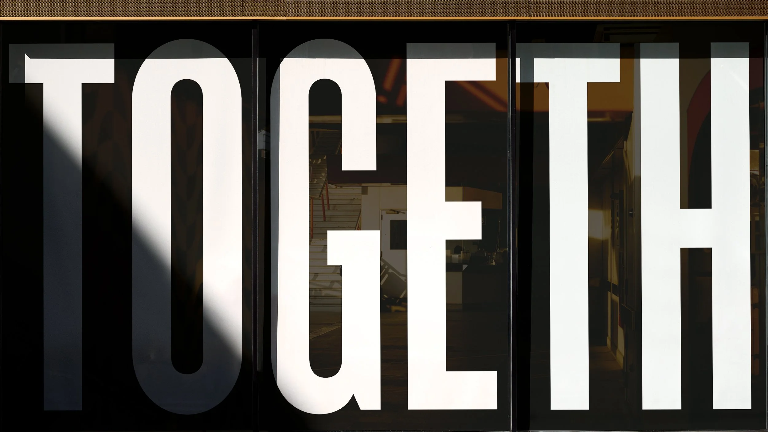
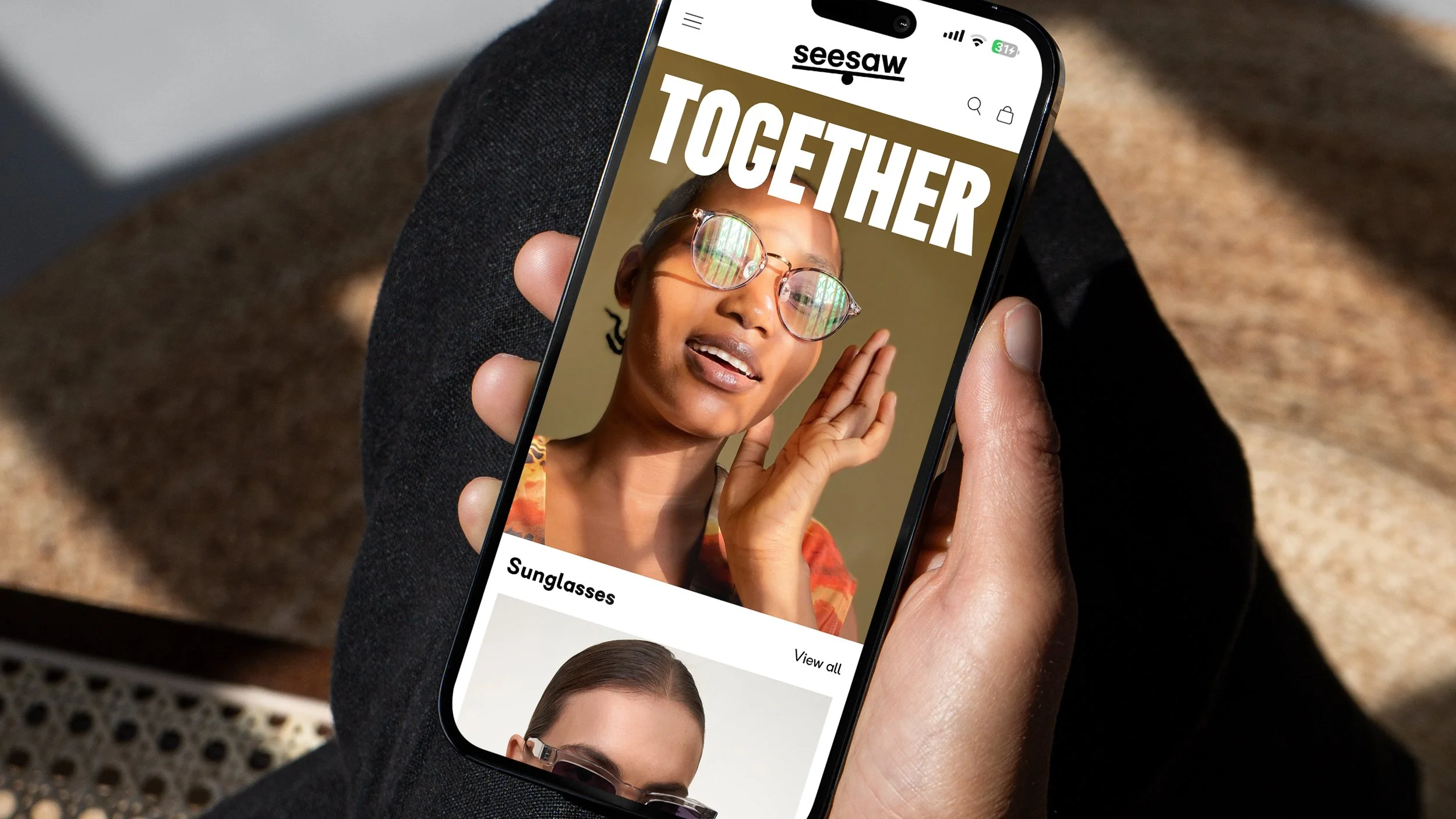
We proposed a simple idea inspired by this approach, based on one single word; ‘Together’. From an engaging window display to a bold brand refresh and quarterly local newspaper, we developed a suite of assets that’ll make everyone stop and stare.
We’ve helped Seesaw to really focus on the feel-good factor of eye care.
We are together!


Working with Slow has been transformative for our brand. The team brought a level of care, clarity and creativity that went far beyond design. They took the time to understand our business and what makes us different — then crafted an identity that reflects that with precision and heart.
The new brand has changed how we’re seen in the community. There’s been a real shift in perception, and it’s had a tangible effect — more recognition, more confidence, and a noticeable uplift in sales.
What stood out most was Slow’s sensitivity and attention to detail. We felt listened to, guided and supported throughout. If you want a brand that truly represents who you are — and where you're going — you couldn’t be in better hands.
Adam Georgiou
Founder